New pricing for the iPhone 6S Plus means you can get the phone from £549 if you’re happy with the 32GB model. However, it’s worth spending the extra to get 128GB for £649 if you can. You can buy an iPhone 6S Plus from Apple’s website – or in store. Clearly these are still steep prices for a year-old smartphone, but unless you want the new features of the iPhone 7 Plus and have plenty to spend, the 6S Plus is arguably better value. Here’s our original review: Being an ‘S’ model, the iPhone 6S Plus doesn’t have looks to distinguish itself as the new phone. But, as Apple’s ads say, the only thing that has changed is everything. That’s stretching the truth, of course, but a lot has changed. S models retain the same physical design of the previous year’s model but get upgraded internals and some new features. This year is no exception. Can the 6S Plus take over the crown as Apple’s flagship phone and keep Android rivals at bay for another year? See also: iPhone 6 Plus vs 6S Plus comparison
iPhone 6S Plus review: Price
Note: we’ve left the original prices in for reference – the up-to-date prices are above. This is one thing that hasn’t changed: the 6S Plus costs exactly the same as the 6 Plus did when it launched in 2014. So it’s £619, £699 and £789 for 16GB, 64GB and 128GB. Let it be said early on that 16GB is unacceptably meagre, inappropriate even, for a phone without expandable storage which records 4K video that consumes almost 400MB per minute. The new model means that the 6 Plus gets a price cut, so if you do buy your phones SIM free, you’ll save a bit by going for last year’s model (which as we’ll see isn’t a bad idea).
iPhone 6S Plus review: Design and build
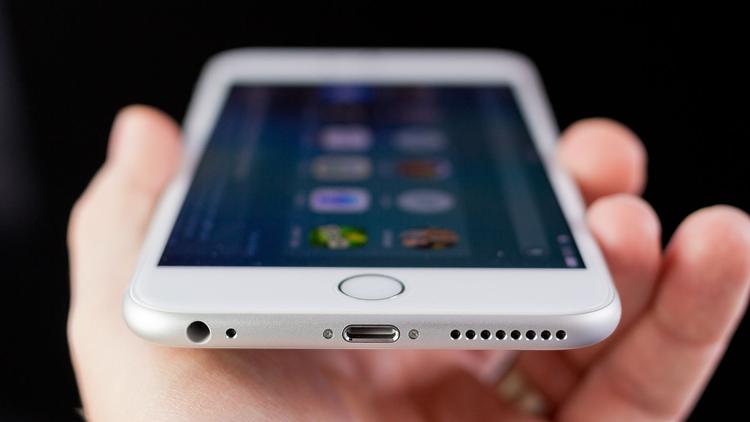
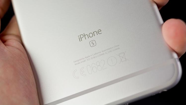
The 6S Plus is a great looking phone and it feels great in the hand. Looks are subjective though, and whether or not you hate the protruding camera, you’re likely to immediately wrap your new phone in a case to protect it from scrapes and knocks. I prefer a bigger screen so it’s not a great compromise to carry a devices that’s larger and heavier than the 6S. It is bigger than some Android phones which have even bigger screens, but none of those devices – Nexus 6P, Galaxy S6 Edge+, Moto X Style – will fit any more easily into a pocket. Of course everything I said in my iPhone 6 Plus review about design applies to the 6S Plus. Both good and bad. It’s still an annoyance that the power button is opposite the volume buttons as it’s easy to turn off the phone instead of increasing volume or taking a photo with the same button. It’s still a two-handed phone for a lot of the time, and Reachability doesn’t really help all that much. It’s quicker and easier in most cases to use your other hand to tap on something at the top of the screen. Also see: Best MiFi 2016. The two phones may look identical, unless you go for the new Rose Gold version, but Apple has used stronger 7000-series aluminium for the 6S and 6S Plus. Almost certainly as a response to Bendgate. This means the 6S Plus is 20g heavier at 192g. That makes it one of the heaviest 5.5in phones, but it’s more than light enough to hold one-handed to watch videos – even movies. There are other subtle differences: the home button has a very slightly different sound and feel and if you put a pair of callipers on it, the new phone is very fractionally thicker. Yet, so far, I haven’t found an iPhone 6 Plus case that won’t fit on the 6S Plus.
iPhone 6S Plus review: Screen + 3D Touch
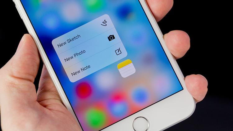
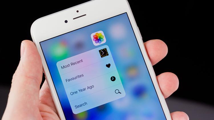
The screen, too, is the toughest yet. It has to be since Force Touch means you’ll be prodding and pushing the screen fairly hard to use the new Peek and Pop gestures which respond to pressure. It’s almost like having a resistive and capacitive screen in one, but with much better image quality than any resistive screen. 3D Touch is the biggest new feature of the 6S Plus and offers a new way to interact with iOS. Since it’s a new feature there’s not an awful lot you do with it, but what you can do is undeniably useful. You can press hard on an app icon and, using the new Quick Access shortcuts, jump straight to a particular function or place. With Mail, for example, you jump straight into writing a new message or to your VIP inbox. You can do the same with Messages, or send a message to your most frequent contacts. Using Quick Actions on the camera app lets you take a selfie without having to launch the app and then change modes. Within apps you can use Peek and Pop. Pressing lightly on an email in your inbox lets you ‘peek’ at it without actually opening it. Yet you can still swipe left to delete it or swipe up to reply. If you want to read the whole message, pressing harder while peeking makes it ‘pop’ open. Within an email or message, you can Peek at websites or maps of addresses that people have shared with you. There’s another great use for 3D Touch: press hard on the virtual keyboard when typing and it turns into a touchpad, letting you move the cursor and select text. Less useful but a fun feature to show off to your non-iPhone 6S-owning friends is Live wallpapers. Apple has a small selection of top-quality images which animate when you press hard on the screen. (You can also set new Live photos as your lock screen wallpaper. More on those in the cameras section.) The impressive thing is that the animation plays faster if you press harder, aiding the 3D feeling: this isn’t just a two-level pressure-sensitive screen. Accessibility hasn’t been forgotten, either. 3D Touch is a great benefit if you’re blind or partially sighted. You can set it so the Quick Action menus are read aloud, and for previews to be read aloud when ‘peeking’. Plus, in the 3D Touch accessibility menu you can set the sensitivity to light, medium or firm, which will help those that can’t push hard enough or lack the dexterity to press lightly. Apple has also put a ‘Taptic Engine’ into the iPhone 6S Plus which offers quicker response than a traditional vibrating motor. It’s the same system used in the Apple Watch and is certainly an improvement over the 6 Plus’ motor. The vibrations help you to know when you’ve pressed hard enough on the screen, but they may be too subtle for some people. Like Siri, you could ignore 3D Touch entirely. But to do so would be to miss out on the ability to get stuff done faster. (If you have an iPhone with Siri and don’t use it, you really should.) App developers can use 3D Touch, but it will be a while before they’re a regular feature. In terms of specs, the screen is otherwise the same: 1920×1080, 401ppi, IPS technology, 100 percent sRGB coverage. It’s a great screen with virtually nothing to complain about. For those who think Apple should have made it Quad HD, there’s just no reason to go any higher than 400ppi. A move to AMOLED? That would be very nice. The cover glass might be tough, but if you break it, it’ll cost you £126.44 to get it fixed, unless you have AppleCare+ in which case you need only pay the excess fee. That’s £20 more than for the iPhone 6 Plus (and 6S) and £40 more than the iPhone 6.
iPhone 6S Plus review: Performance and hardware
As with any new iPhone, there’s a new processor in the 6S Plus: the A9 and M9 motion coprocessor. Apple has also increased RAM from 1GB to 2GB. You can see how this affects performance in our benchmark graphs below.
In real-world use, the 6S Plus doesn’t feel twice as fast as the 6 Plus, but both are powerful phone and it’s only when they age (and get future iOS updates) that you’ll need – and notice- the 6S Plus’ extra grunt. Apps launch very quickly, and there’s hardly any delay switching between apps in iOS 9. There’s never a sense that the 6S Plus is struggling due to a lack of speed. The Touch ID sensor is noticeably quicker though and is so fast to recognise your fingerprint that you’ll have to use a finger not registered if you want to merely check the time and notifications without unlocking your phone. Most of the time, a quick press of the button with a registered finger is enough to turn on and unlock in one smooth movement. Despite the extra weight, the battery is smaller in capacity compared to the 6 Plus: 2750mAh against 2915mAh. However, the die shrink from 20nm to 14nm means the A9 processor is more power efficient. iOS 9 also introduces – finally – a battery saving mode. So while battery life should be the same as for the 6 Plus in spite of the 3D Touch screen and faster processor, you can eke out even more time between charges by letting Low Power mode switch on when the battery gets down to 20 percent. It turns of many things, including push email, and lowers power consumption by decreasing the screen timeout and screen brightness. It definitely works, and so far I’ve been able to just about get through two days if I’m not hammering the phone throughout each day. It helps to quit apps which use too much power in the background (even going as far as disabling background updates for apps such as Facebook if you can handle it) but suffice to say that the 6S Plus will comfortably get through a single day even with intensive use.
iPhone 6S Plus review: Cameras
There was disappointment when the iPhone 6 and 6 Plus launched with cameras that had the same basic specs as the iPhone 5S. Now there’s a significant upgrade. That’s right, a huge jump from 1.2Mp to 5Mp on the front-facing camera. Apple has lagged behind Android phones for a long while in this respect. While FaceTime or Skype chats were perfectly reasonable, selfies or any other photo or video that had to be taken with the front camera were disappointing at best (when compared to the rear camera). Now, selfies are respectable and not just for viewing in tiny versions on Facebook or Instagram. The flash isn’t quite as successful. In dim conditions, the screen will flash briefly to light your face but the effect it has is to make a bigger disparity between the darkness of the background and the brightness of your face. It’s not all that flattering. However, it can make all the difference and at least give you usable photos. Plus, skin tones are pretty good thanks to the fact that screen flashes different colours depending on the white balance of the scene – much like the True Tone flash at the rear. Also new is live photos. These capture 1.5 seconds of slow framerate video when you take a photo. Then, when you’re browsing photos later you can use 3D Touch to press on the screen and make the still photo come to life. Apple is preparing an update so the recording is cut short if it detects you’re moving the phone away. Currently, many live photos end with you putting the phone down or in a pocket. Whether they will take off and not remain a gimmick depends on support from Facebook, Instagram and the ability to share them with more than just other iPhone and Apple Watch owners (El Capitan also supports live photos). Getting to the rear camera, the pixel count has been increased from 8- 12Mp. That’s not as significant as it sounds, and photo quality isn’t drastically different to the iPhone 6 Plus. You won’t be able to scroll through your camera roll after upgrading and immediately tell at which point you switched to the 6S Plus. These photos show why. They were taken seconds apart, then resized and aligned (sort of) in photoshop: Here’s a 100 percent crop from the 6S Plus: And here’s a 100 percent crop of the 6 Plus’ photo: The crops show clearly that you get a bit more detail from the 12Mp sensor, but the difference isn’t quite as significant as you might have expected. The sharpness of both photos is roughly the same, but the 6S Plus (in these conditions) delivered noticeably different colours. Here are some other samples from the 6S Plus, resized to 1600×900 pixels but otherwise unedited: So there’s no earth shattering difference in detail and resolution, but that’s not to say photos aren’t great. Far from it. The 6S Plus takes excellent photos in virtually all conditions, just as previous iPhones have. It’s this fact that makes the iPhone such a great camera: it’s reliable and consistent. Exposure, focus and colour are all great most of the time. There is more detail, but you’re not going to notice it unless you zoom in or need to crop a photo. Apple talked of deep trench isolation at the 6S’s launch, which basically means light should fall on a pixel and not on its neighbours, leading to better colour. The colour filter has also been moved directly on top of the pixels to help with this. However, in order to add 50 percent more pixels, it has had to make them physically smaller, down from 1.5µ to 1.22µ. Yet the maximum aperture remains f/2.2, which doesn’t let in as much light as some Android rivals with f/2.0 or even faster. This comes at a cost: noise. It’s hardly rampant, but when you look closely at photos taken in anything other than bright light, you’ll see noise. It’s also evident in videos shot in low light. Video enthusiasts are in for a treat since there’s now support for 4K. Proper support. You’re limited to 30fps, but you still get stabilisation; optical stabilisation is only found on the 6S Plus and unlike on the 6 Plus is now used when shooting video for an even more cinematic feel. Optical stabilisation makes a huge difference and with steady hands you really can get some professional-looking footage. The A9 processor is powerful enough to process and edit 4K video right on the phone. Just bear in mind it costs a lot in terms of storage: 375MB per minute. Detail is, of course, fantastic, and quality is right up there with the best phones that can capture 4K. Slo-mo and Time-lapse can’t be shot in 4K sadly. But both of those features deliver great video, though. Add some lenses, such as wide-angle and telephoto from Olloclip or – if you can afford them – Schneider, and you’ll get some outstanding near-broadcast quality footage such as this short film of London (shot on an iPhone 6S with various Schneider lenses, tripods and dollys).
The bad news is that you have to dive into the Settings app to change resolution for video and framerate for slo-mo. It’s no longer a toggle within the camera app in iOS 9. Being able to shoot 1080p at 60fps is wonderful when light is good, but try and grab a clip indoors at night and you’ll be faced with a black screen and a 30-second mission to flip back to 30fps. Hopefully Apple will listen to feedback and put the settings back in the camera app in iOS 9.1.
iPhone 6S Plus review: Software
iOS 9 looks very similar to iOS 8, but there are lots of useful little changes that make it easier to navigate and use. One of the best is the ‘Back to’ link at the top left which appears when you tap a link that fires you into another app. It means a quick tap is enough to return to where you were instead of going to the home screen first, or double-tapping the home button and using the task switcher (which now looks just like Android’s). There’s another one to pick out: Notifications are now ordered by time, not app. It’s actually useful now, and you can dismiss alerts by day. There’s still no ‘dismiss all’ button, but it’s a positive improvement nonetheless. And, of course, there are scores of other updates and improvements throughout the OS. See also: iPhone 6S vs 6S Plus comparison: what’s the difference? Jim has been testing and reviewing products for over 20 years. His main beats include VPN services and antivirus. He also covers smart home tech, mesh Wi-Fi and electric bikes.


